

As much as Starfield is a great explorative adventure, bad UX withholds me from picking it up often.
I've been an avid gamer for most of my life. It started all the way back when my brother got a Gameboy Pocket as a birthday gift. I remember launching Pokémon Blue and being forced to make the biggest decision of my life, which starter to pick? After a while we transitioned from black- and white to the colourful Pokémon Crystal on the Gameboy Color and we were overwhelmed. The little creatures even moved when attacking. Obviously games nowadays are not even remotely comparable to what they made back then, but there are some things that confuse me. One of these is the bad implementation of UX in a lot of modern games. I remember being able to navigate through the old Pokémon games without any instructions whatsoever. Hell, I didn't even speak English. The UI of a 2D game with about 5 options is obviously hard to compare to modern games, but not impossible. If we go back to the basic fundamentals of UX Design, I feel like a lot of these games skip usability. They instead choose form over function. In this article I'll highlight a few Bethesda games from over the years and talk about my personal experience with their UX and UI.
Previous Bethesda games
Skyrim
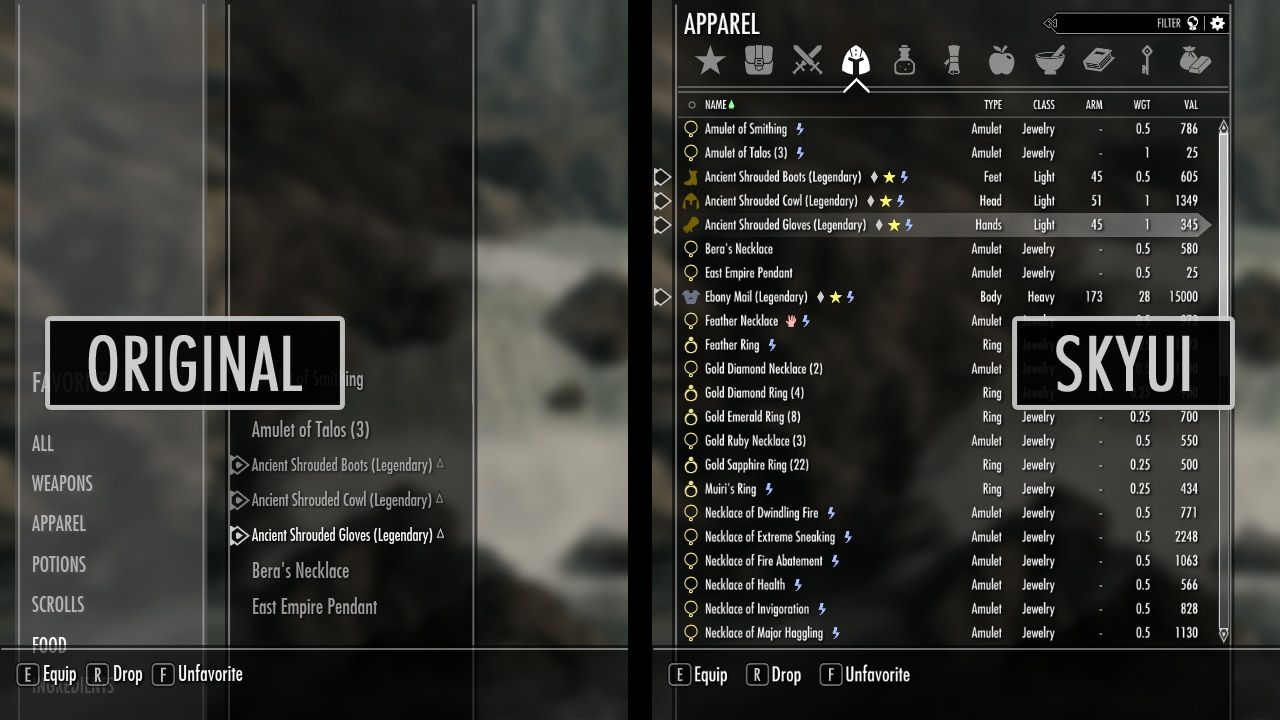
I've always had a weakness for Bethesda games ever since Oblivion came out. After Oblivion came Skyrim, which I played for hundreds of hours on the PS3. I then transitioned more towards PC gaming and continued my Skyrim journey on Steam. I read somewhere that there were loads of mods to try out so of course, I looked it up. One of the most downloaded mods was SkyUI, a mod that overhauls the entire inventory and UI system. After hours of playing Skyrim on console, I didn't entirely realise how much time I had wasted sitting in inventory screens. I was so used to it that it didn't even bother me at first. When I downloaded the SkyUI mod on my PC however, it was such a relief. I didn't know what I had missed. I can honestly say that it cut my inventory management in half easily.
Bethesda games are known for their vast worlds where you roam around like a scavenger, picking up anything that looks remotely valuable. This also means that you spend a huge amount of time managing your inventory. Unfortunately, Bethesda repeatedly misses the mark in this department. Not only is it confusing, it's slow. For a game that heavily depends on the items you carry, the management of these items is very sluggish. It's a recurring theme in Bethesda games, so I kind of hoped that they would step it up in later releases, but Fallout 4 wasn't anything to write home about either.
Fallout 4
For those who don't know Fallout too well, it's basically a scavenger hunt in a radioactive wasteland. The game is heavily dependent on the Pip-Boy, a wearable arm-device where you do most of your actions. Think inventories, skill points, quest tracking etc. As it's a Bethesda game, you do these actions quite often. But now instead of having an entire screen dedicated to your menu, you get a partial in-game screen in the form of a Pip-Boy.
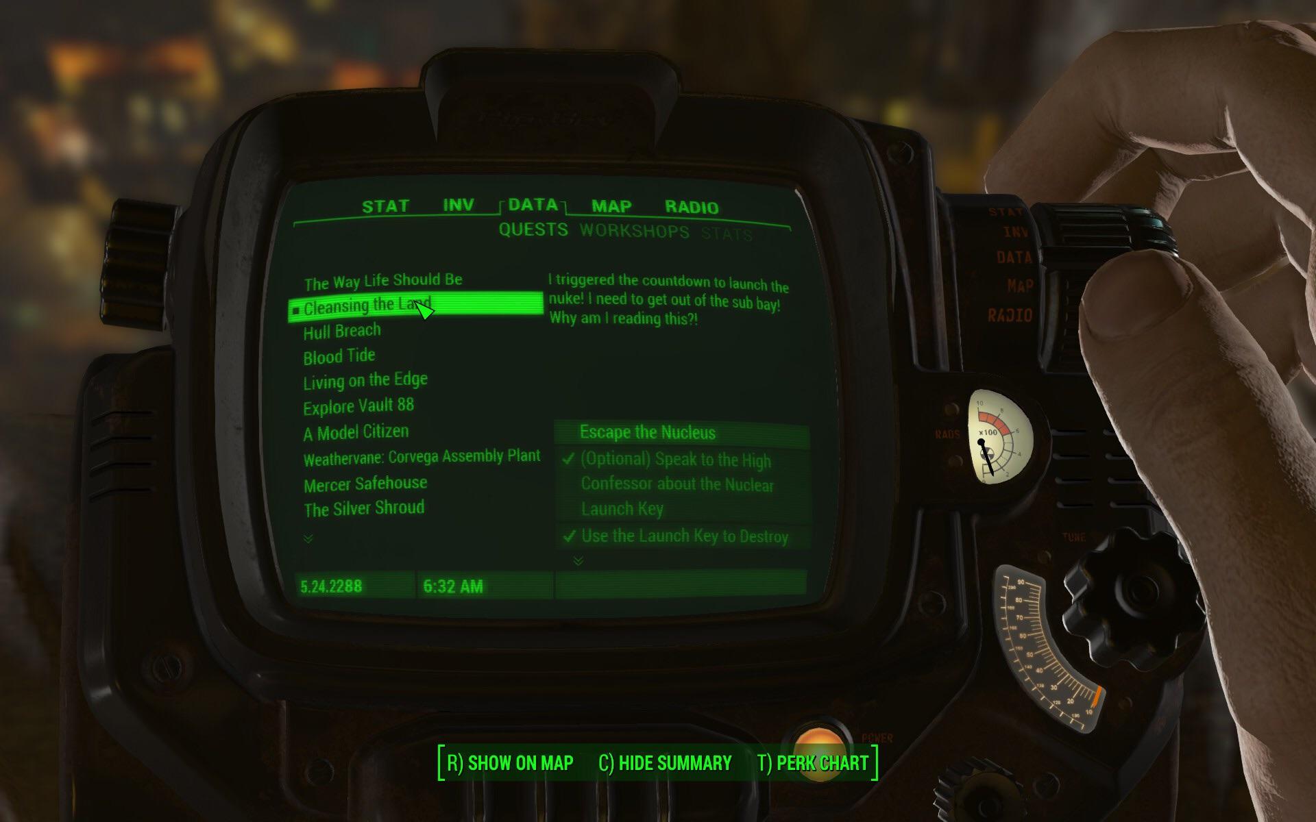
I think the idea of the Pip-Boy is fine, it's a fun way to incorporate menu's in the game. It feels more attached to the character. Usability wise it's not great. You're already limited in space because of the in-game object you're using, but it's also hard to navigate through. There are loads of options hidden behind menu's that I didn't know even existed. And as Skyrim did, so does Fallout hide most of the important information of items in the overview. This forces you to scroll through your entire list of items to figure out which item is taking up so much space. This is a recurring theme in all Bethesda games. Instead of showing me useful information, I just get a list of names. Names that in most cases don't mean anything to me. Starfield probably takes this to the next level.
Starfield
I really looked forward to the release of Starfield. It has been a long time since I literally waited for the date to start playing instantly. Now that I've played the game a bit, I can honestly say that this UI is among the most infuriating I've come across. The game got an inventory overhaul mod within a week. That is mostly because Starfield is even more heavily dependent on inventory management. It feels like I'm shifting around items in multiple inventories for 50% of the game time. And whenever you do, it looks like this:
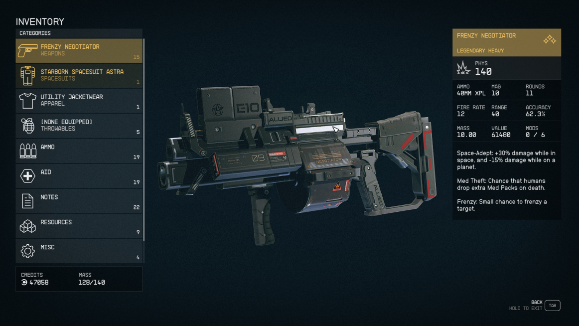
It's a step up from Fallout out for sure, but it's still so tiresome to use. It somehow feels cluttered, but it hides a lot of important information. One of the most important things that you use your inventory for is weight distribution. You start off with a cap of around 120 (kg?). This fills up pretty fast because as soon as you encounter your first few space pirates, you pick up their armour and helmets. After a few looted pirates, your inventory is already close to cap, which means you have to decide what to keep right there. As the game is still in somewhat of an introductory stage at that point, you don't really know what makes one armour better than the other. When I tried comparing the armours, I had no idea what to look for. It's a bunch of numbers with either a green or red indicator, some text about perks, and weight. I threw away most of the armours, but to this day I don't know if I threw away anything valuable.
There is a similar experience when figuring out what guns to use. The game doesn't really help you in any regards to inventory management. It just throws you into the deep and expects you to figure it out, which in some cases is fine. In this case, it's not, especially since it's a crucial part of the game. I thoroughly enjoyed exploring the world, but I hated every second that forced me into inventory management. At some point it was a continuous cycle of throwing away 20% of my items, to only fill it back up after 10 minutes of playing.
Inventories aside, the entire menu system is kind of trash. At some point I wasn't even sure if my menu worked properly. I've been a UX Designer for a few years now and in those years I often come across weirdly designed interfaces, but nothing like this. It feels completely random, as if someone turned on a random button generator and assigned the most crucial actions to whatever came out.
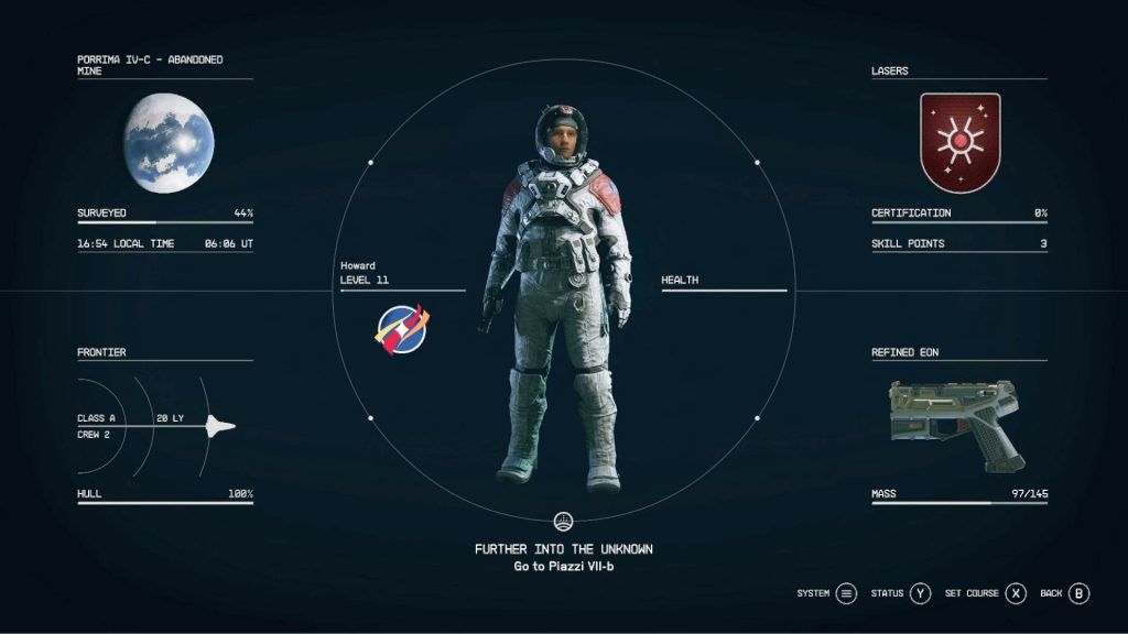
PC gamers have around a hundred keys that they can bind actions to. You'd expect the most crucial decisions you make to be bound to different keys to prevent error. You'd also expect buttons to have somewhat of a logical layout. There are millions of examples that you can take inspiration from as a UI designer. However, for some unknown reason, Starfield doesn't seem to think that usability is important. In the hours that I've played the game, I still haven't figured out the right way to do things. I probably use Tab the most to get out of the menu I'm currently lost in. Apart from being confusing, they never really tell you how to use it properly. I'm one of those people who instantly presses "Ok" if I get a random pop-up message whenever I'm in the middle of a game, so the fault's partly on me. I also don't like to read walls of text when I'm busy killing space pirates. I think that game menu's should be usable without instructions. It should be intuitive, just as the controls the gameplay itself should be intuitive. Crucial actions shouldn't be prone to error.
One of those crucial actions is accepting a hail from the space police. As in previous Bethesda games, you can steal, pickpocket, and carry around stolen goods. Some planets in Starfield have some sort of police circling around that scan your ship for contraband. When they detect contraband, you get an incoming hail. Your only options are "Accept" and "Ignore", at least that's what I thought. The first time this happened to me, I forgot that the button for accepting the hail is the same as standing up in your ship. I tried to be a good citizen and accept the hail and hand over my stolen goods, but instead my character stood up and therefore ignored the hail. After a few seconds my ship was destroyed and I was dead.
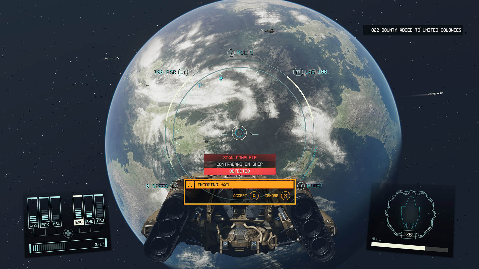
It turns out, pressing the button accepts the hail, but holding the button still lets you stand up and ignore the hail. Things like this and the consistent horrible item management makes the overall UX rather annoying. I understand that some of the problems I have with the interfaces and button layouts annoy me more than the regular gamer, but most of it does impact the overall game experience. Now do I hate Starfield because of it? No, I don't. But the bad UX combined with the rather even worse video performance ruins some of the fun I hoped I would have. The PC I run Starfield on is about 6 years old and houses a 1080 Ti and a 7700k, but I barely scrape 50 fps in quiet locations. It's the worst performing game I've played lately, and it's not even close. Even on settings that makes it look like I'm playing DOOM from 1993 the game runs like shit. I don't feel like booting it up as much as I'd hoped. As someone who's a big Bethesda fan and has played nearly every game they've released, it's a bit of a disappointment to me.
Conclusion
Interfaces in Bethesda games are a huge part of the experience. As most of their games are almost like an enhanced scavenger hunt, you'd expect some of the inventory management to be intuitive. In my opinion, Starfield has missed the mark once again and Bethesda keeps the trend going. They seem to have chosen form over function unfortunately. It looks great aesthetically but misses a lot of functionality. It might be a good idea to hire the StarUI creator for the next iteration of The Elder Scrolls, but that's wishful thinking. I won't say that the poor UX has ruined the entire game experience, but it certainly didn't help. I'd wish I picked up the game more, but because of the slow menu's and poor performance, I see myself already gravitating to other games. Bethesda isn't the only one that releases games with poor UX, but it's certainly one of the most consistent ones. Maybe I'll write about some more games in the future, but for now I've ranted enough.