

Join us as we delve into the 'enshittification' of logos and the cyclical nature of design trends, culminating in the philosophy that true success in logo design lies in functionality and adaptability.
In the fall of 2017 I took the opportunity to study in the United states of America for 6 months at Minnesota State University Mankato (MNSU). Aside from eating copious amounts of Chick-fil-A Chicken Biscuits (Yes they are that good, please visit a Chick-fil-a before you die), I realized that famous logo designer Aaron Draplin was going to give a talk at our university.
This was exciting to me since I had been following Aaron Draplin’s work for quite some time. I had quietly been saving what meager money I didn't spend on the aforementioned Chick-fil-A to buy his book Pretty Much Everything by Aaron James Draplin.
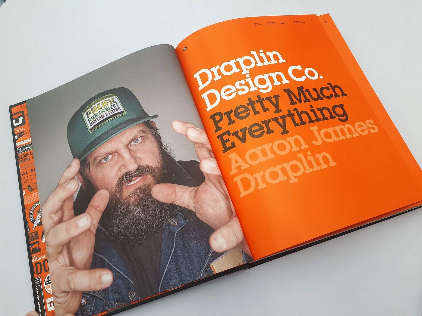
See, back then, Aaron Draplin was a famous, well respected designer that created work using these bold colors and thick lines that jumped off the page. Heck, Aaron was to young graphic designers what Steve jobs was to the average iPhone Junkie; a famous superstar that could do no wrong and had to be imitated in every way conceivable. His logo work specifically was iconic.

The talk that Draplin was going to give was well sold out before I got to know of it. I remember Usher being booked for a party at the university that year as well, and it was certainly easier to get tickets for Usher. Back in the mid to late 2010’s Draplin’s style was the golden standard of wordmarks and logos. Nowadays, things are quite different.
In the last couple of years, a trend has been developing where logo’s that seemed a tad outdated, receive a redesign that removes certain unique aspects. These logos are reduced to mostly a font and some distinct color. No more Aaron Draplin madness, just type and hexes. Why is this happening? Why should you care as a designer and is this a positive or negative development?
LinkedIn rage
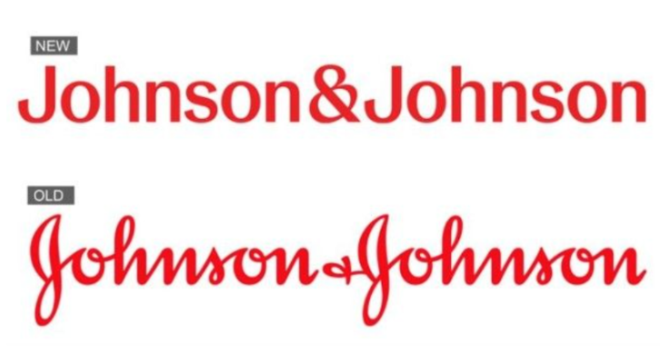
As I was browsing Linkedin, looking at the millionth insightful “LOOK AT THESE TWO BUTTON DESIGNS, WHICH DESIGN IS BETTER, 💡FOR A, ❤️ FOR DESIGN B” post, I came across some sentiment about the Johnson & Johnson rebranding.
A Linkedin user saw this rebranding and could not hold his tongue, he had to comment on this update:
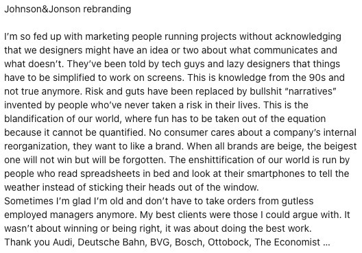
As this user cites, the “enshittification” of brands seems to be propelled by a need to simplify logos because these monotone logos would work better on screens. But is this really the case?
Cathay Lane, the primary writer for the blog Logo Lounge, said in her in 2023 logo trend report:
I start to notice patterns or certain conditions that exist when logo trends emerge. Logos don’t simply emerge from thin air either, no pre-existing conditions, no context. And if they do, they’ll appear anomalous to the public.
And Cathay is right. In the early 20th century logos were often elaborate, shouting for attention, because they reflected the Art Nouveau and later Art Deco movements of the time.
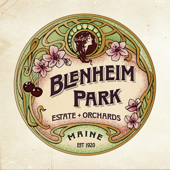
Color printing was a luxury reserved for corporations and wealthy individuals. As time progressed the rise of modernism made logo’s simple again. The “form follows function” ideal, which is still popular today, was propagated by Bauhaus founder Walter Gropius.
Enshittification
But then, the fire nation attacked, in the form of the digital age and computers. Suddenly logos didn't mostly live on print anymore, logos had to be eligible for a myriad of platforms. And that is how we got to our “enshittification” today. Your logo should be able to work on both the tiniest phone screens as well as huge billboards worldwide. This globalization of brands and the digital friendliness their logos necessitate, naturally result in simple two dimensional logo elements with limited color patterns and clean lines.
In a world that is begging for every scrap of attention from your brain every second of the day, standing out actually means toning your visuals down as a brand. Minimalism makes it more likely that your logo can grab and subsequently hold the attention of your target audience.
So whether you as a designer think this move to simplicity in logo design is “good” or “enshittification”, simplicity is here to stay. For now. As is clear, logo design and brand design in its entirety heavily follows trends. Trends that, when looked at from a bird's eye view, seem highly cyclical in nature.
Conclusion
In my humble opinion, logos, much like effective UX design should be functional and adaptable. Not just aesthetically pleasing. Like the Nike logo that was made by design intern Carolyn Davidson, successful logo’s manage to distill the essence of a brand into its simplest possible form without losing its identity, which truly is the ultimate goal of logo design.